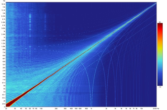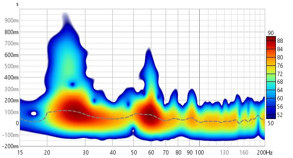
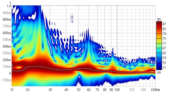
This graph shows a spectrogram plot of the measurement, which is a form of time-frequency plot that shows how frequency content varies over time. It can be used to view the results of sweep measurements, the frequency content of imported audio files (with length restrictions) or the results of stepped sine measurements for which the spectrum data has been captured at each measurement frequency.
The spectrogram is like a waterfall viewed from above, with the level indicated by colour. The scale showing how colour relates to level is optionally displayed to the right of the plot. The plot has five modes: Fourier, Wavelet, Airy CWT, Morlet CWT and Burst decay. Fourier mode uses the short-time Fourier transform (STFT). Wavelet and the CWT modes are all wavelet transforms, differing in their implementation. In Fourier or the wavelet modes the vertical axis of the plot can show time, increasing towards the top of the plot, or frequency with time on the horizontal axis. In Burst decay mode the time axis is replaced by a periods axis.
When viewing sweep measurements in Fourier or wavelet modes the time starts before the peak of the impulse so that the onset of the response can be seen. The areas where the response is decaying more slowly show up as streaks along the time axis. The dashed line is the Peak energy time trace which shows the peak level in the plot at each frequency. This can highlight variations in peak energy arrival versus frequency - an ideal peak energy time trace would be a straight line with the same time value for all frequencies.

The spectrogram plot in Fourier mode is generated in the same way as the Spectral Decay plot, shifting the impulse response window to the right by a proportion of the time range to generate each succeeding slice. The window type is selected in the graph controls. The plot uses logarithmically spaced data at 96 points per octave.
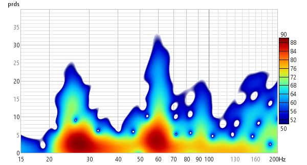
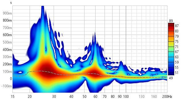
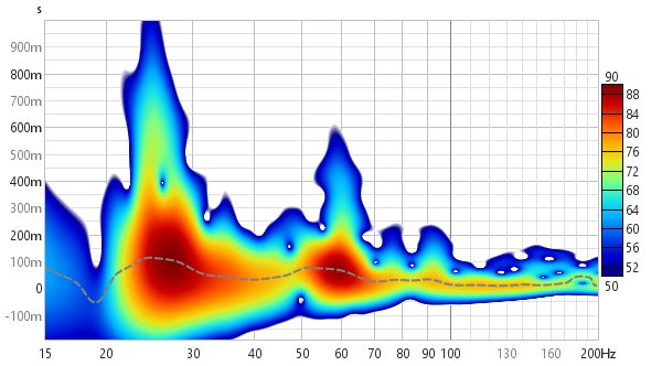
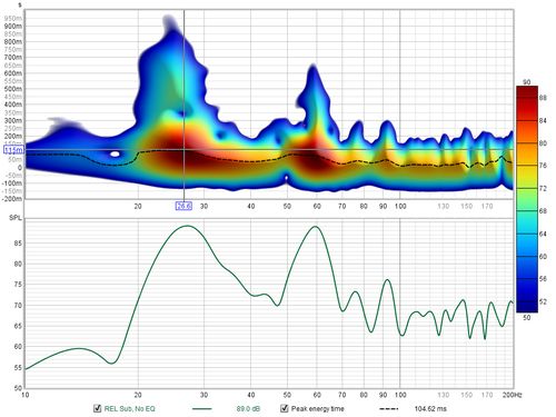
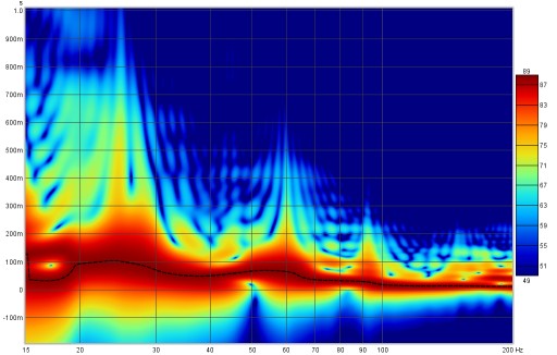
In Burst decay mode the decay starts from the peak of the impulse and is shown along an axis of the number of periods for each frequency, so that resonances with the same Q show the same rate of decay. Comparing the Fourier spectrogram above with the 1/6th octave Burst Decay spectrogram below it is evident from the Burst Decay that the 60 Hz resonance has a higher Q than the 27 Hz resonance, though the 27 Hz resonance has a longer decay time.
The spectrogram plot is generated automatically when the graph is selected, or may be manually regenerated using the Generate button in the bottom left corner of the graph area (shortcut Alt+G). The legend panel shows the plot value at the intersection of the vertical and horizontal cursor lines.
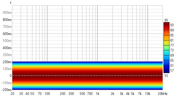
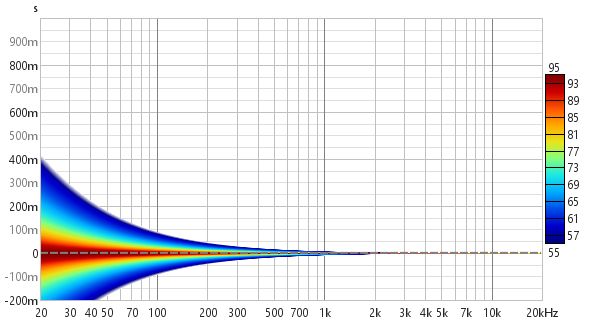
An ideal Spectrogram decays very rapidly off the bottom of the scale range. Here is an example of a plot produced from a soundcard loopback measurement in Fourier mode.
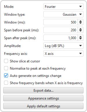
Mode selects the type of spectrogram plot that will be produced, which can be either Fourier, Wavelet, Airy CWT, Morlet CWT or Burst Decay.
In Fourier mode the plot uses fixed width windows, which means the plot has the same time resolution at all frequencies. If the plot spans a wide range of frequencies this usually means the time resolution is either too low at high frequencies or too high at low frequencies. A 100 ms window, for example, gives 10 Hz frequency resolution. At low frequencies that is a big octave fraction (1/1.4 octaves at 20 Hz), at high frequencies a very, very small octave fraction (1/1386 octaves at 20 kHz). For a time-frequency plot it would be more useful if the trade-off between time and frequency resolution varied with frequency, using a constant octave fraction for frequency resolution rather than a constant number of Hz and so giving higher time resolution at high frequencies and lower at low frequencies. A wavelet transform can achieve that, specifically a constant Q Continuous Wavelet Transform (CWT).
A constant Q wavelet transform is mathematically equivalent to using a frequency-dependent window to produce the spectrogram, which is what REW does in the Wavelet mode. The implementation uses complex smoothing, which may produce some artefacts in parts of the response that extend to frequencies close to half the sample rate - using a higher sample rate shifts these beyond the usual range of interest. The smoothing approach has a more pointed kernel than the CWT implementations and so may better delineate some high amplitude features of the response, at the expense of more artefacts at low amplitudes. Wavelet mode data is produced at time increments across the chosen span, generating a frequency response at each time slice.
The CWT modes generate data at specific frequencies for the time range of the plot. In these modes plots can be produced at a selected frequency spacing, between 24 and 96 points per octave. The default is 48 PPO. Higher PPO means longer calculation time. The Morlet wavelet is commonly used for CWT, though it has some deficiencies at high time resolutions, producing artefacts which are a consequence of it being only approximately analytic. The Airy wavelet is from the γ = 3 family of the generalised Morse wavelets. It is exactly analytic and has better performance than the Morlet wavelet at octave fractions from 1/1 to 1/5. At high frequency resolutions, octave fractions from 1/12 to 1/24, the Airy wavelet produces artefacts and the Morlet wavelet is a better choice.
When analysing impulse responses the CWT modes use scale normalisation, so that the spectrogram of a perfect impulse has a peak level that is constant at all frequencies. When analysing imported audio data scale normalisation is not used, so that tones at equal amplitudes but different frequencies have the same level on the spectrogram.
Here is a 1/6 octave Wavelet spectrogram of the same soundcard loopback measurement shown above. It becomes narrower as frequency increases, reflecting the increasing time resolution of the wavelet plot.
Here is the same measurement from the first image above as a 1/12 octave Wavelet spectrogram.
Here it is as a 1/12 octave Morlet CWT.
The difference between the Fourier and Wavelet spectrograms can be more easily seen when looking at responses with reflections. Here are two plots of a response which has a series of reflections at 1 ms intervals after the peak. In the Fourier spectrogram, using a 10 ms window and a 10 ms span after the peak, the effect on the frequency response and decay are clearly visible, with peaks at 1 kHz intervals. However, the reflections themselves cannot be distinguished.
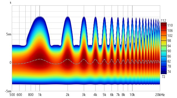
The wavelet plot (1/12 octave) also shows the frequency response and decay effects, but thanks to its greater time resolution at high frequencies the reflections themselves become visible as horizontal bars.
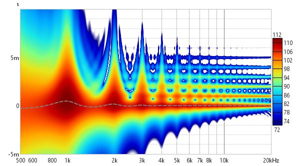
The 1/12 octave Morlet CWT also shows the reflections:
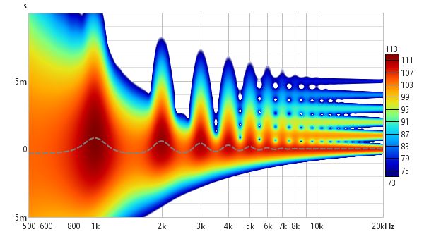
In Wavelet and CWT modes a Freq. Resolution control replaces the Window control and allows resolutions between 1 octave and 1/24th octave to be selected.
The Burst Decay mode provides a way to more easily distinguish resonances of similar Q but different frequencies. It does this by showing the way a shaped tone burst at each frequency would decay, but along an axis denoted in periods of the frequency rather than time. On a period axis the extent of a decay is the same for resonances of the same Q regardless of the frequency of the resonance. The plot is produced by convolving the windowed impulse response (using whatever current window settings have been applied to the measurement) with a complex Morlet wavelet analytic signal (a Gaussian windowed complex exponential) to extract the decay envelope then resampling that decay on a period-based scale. That is repeated at 48 points per octave across the frequency span of the measurement, with 10 Hz as the lowest frequency allowed and the burst bandwidth below half the sample rate as the highest. Note, however, that an artefact of the period axis is to skew the tail of the decay slightly towards higher frequencies rather than maintaining the symmetry about the resonance's centre frequency that would be seen in a time-based plot.
In Burst Decay mode a Bandwidth control allows burst bandwidths of 1/3rd or 1/6th of an octave to be selected. The 1/3rd octave choice favours time resolution, the 1/6th octave choice favours frequency resolution. With the 1/6th octave burst resonances are more easily distinguished. With the 1/3rd octave burst reflections become more evident in the plot, showing up as curved lines. The image below is the same response with reflections examined using the Fourier and Wavelet spectrogram plots above, but using a 1/3rd octave Burst Decay.
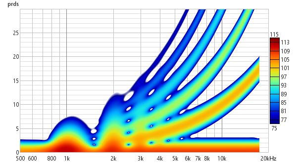
Burst decay plots may have visible artefacts near the high frequency limit, though typically more than 40 dB below the peak level. A Periods control sets the number of periods the plot will span. A Freq. spacing control sets the frequency resolution of the plot to 24, 48 or 96 points per octave.
The Window type control selects the window that is used for each slice of a Fourier spectrogram, Hann is well suited to viewing the content of imported audio files, Gaussian provides a more optimal time/frequency trade-off for sweep measurements.
The Span before peak and Span after peak controls determine how much spectrogram data will be generated around the impulse response peak for a sweep measurement. There are no span controls for imported audio files, the spectrogram is generated for the whole span of the file.
The Amplitude control offers a choice between linear and logarithmic scales. The log scales are dB SPL and dBFS, the linear scales are % peak and % FS. Using the linear % peak scale with a Wavelet plot makes it easier to see timing shifts. The dBFS and % FS scales may be useful when viewing imported audio files.
Frequency axis determines whether frequency is along the X or Y axis. Spectrograms of audio data typically have frequency along the Y (vertical) axis, having frequency along the X (horizontal) axis allows easier visual comparison with waterfall plots.
Normalise to peak at each frequency scales (boosts) the plot at each frequency so that it has the same peak value. This can be useful when examining energy decay or the time alignment between drive units as it removes the level differences. Note that using 3D enhancement with normalisation may result in artefacts along the frequency axis.
If Auto generate on settings change is selected the spectrogram will be regenerated automatically if a setting is changed, otherwise new settings will not be applied until the Generate button is pressed.
If Show slice at cursor is selected the graph is split with the spectrogram on the top and a plot of the level at the cursor Y axis position underneath. The graph will show either level vs frequency or level vs time depending on whether frequency is on the X axis or the Y axis.
Settings can be copied and pasted between measurements by right clicking on the controls panel.
Export data allows the data values for the time or period slices to be exported as text.
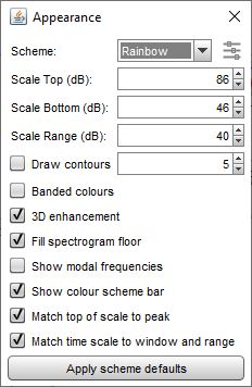
The Appearance settings button opens a dialog with settings that control the appearance of the spectrogram.
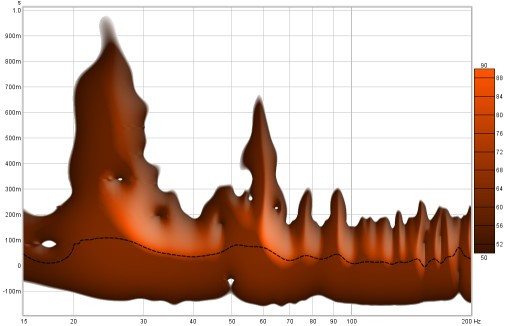
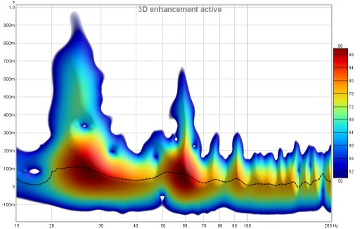
The colour Scheme for the plot can be changed, the plots above use the "Heat" scheme, here is a plot using the "Copper" scheme with 3D enhancement active.
One of the colour schemes is based on cubehelix by Dave Green, see https://www.mrao.cam.ac.uk/~dag/CUBEHELIX/. It is based on a helical path around the diagonal of an RGB colour cube, taking into account the perceived intensity of colours to create a scheme that perceptually has monotonically increasing brightness. The cubehelix scheme can be configured to change its appearance using the settings panel below, which is activated by clicking the icon to the right of the colour scheme selector:
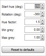
Start hue is the hue in degrees at the base of the plot. Rotation is how many degrees the helix travels around the cube diagonal, setting rotation to zero produces a scheme with a single hue. Rotation can be positive or negative. Hue factor is a scaling applied to the colours, a factor of 1.0 ensure perceptual uniformity but higher values produce a more colourful scheme. The original scheme covers the whole span from black to white, but the Min grey and Max grey controls allow starting at a level above black, making the start hue visible, and ending before white, leaving some colour at the top of the scale.
The Scale Top, Scale Bottom and Scale Range controls adjust how the plot colours correspond to the values in the Spectrogram data. Any values higher than the Scale Top are drawn in the colour at the top of the scale, any values lower than the Scale Bottom are drawn in the colour at the bottom. If the Scale Top setting is changed the Scale Bottom will be adjusted to keep the same Scale Range. If the Scale Bottom is changed the Scale range will be adjusted to keep the same Scale Top. If the Scale Range is changed the Scale Bottom will be adjusted, keeping the same Scale Top.
Draw contours adds contour lines at the dB interval set in the adjacent spinner.
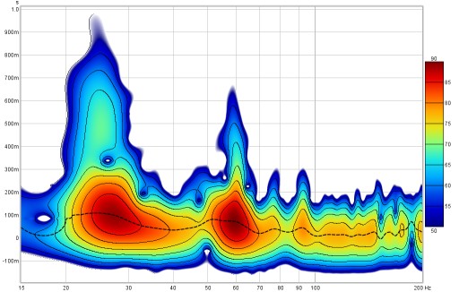
If Banded colours is selected the colour scale has discrete steps rather than a continuous blend from one colour to another - there are 11 colours in that case to provide 10 bands across the scale range.

3D enhancement gives the plot a more three-dimensional appearance.
Fill spectrogram floor fills the floor of the plot with the colour at the bottom of the scale range. When the floor is filled the grid is drawn on top of the spectrogram, it can be shown/hidden using the Show/Hide Grid toggle in the Graph menu or using the Ctrl+Shift+G shortcut.
If Show modal frequencies is selected the theoretical modal frequencies for the room dimensions entered in the Modal Analysis section of the EQ Window are plotted at the bottom of the graph.
Show colour scheme bar controls whether the bar showing the relationship between colours and SPL is shown to the right of the graph.
Match top of scale to peak adjusts the Scale Top value so that it corresponds to the highest level found in the data.
Match time scale to window and range adjusts the time axis range so that it starts at the Window width before zero (e.g. -300 ms for a 300 ms Window setting) and ends at the Time Range (e.g. 1000 ms for a 1000 ms Time Range) so that the plot shows all the generated data.
The control settings are remembered for the next time REW runs. The Apply Default Settings button restores the controls to their default values.
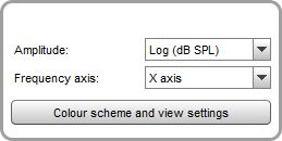
Stepped sine measurements have a much reduced set of controls, to select the amplitude, frequency axis, colour scheme and the SPL range. The equivalent of the time axis for stepped sine measurements is the test frequency at which the spectrum data was captured, those frequencies are shown along the axis. When a stepped sine measurement is selected the axis is automatically scaled to show all of the test frequencies in the measurement, but it can subsequently be zoomed in or out using the axis zoom buttons. Note that spectrograms can only be generated for stepped sine measurements that had the option to Capture spectrum data at each frequency selected.
